Resolutions and Display Specifications
| Device | Retina | Portrait (px) | Landscape (px) |
| iPhone 13 Pro Max 13, 12 Pro Max |
Retina OLED | 1242 x 2688 | 2688 x 1242 |
| iPhone 13 Pro 13, 12 Pro |
Retina OLED | 1284 x 2778 | 2778 x 1284 |
| iPhone 13 13, 12 |
Retina OLED | 1170 x 2532 | 2532 x 1170 |
| iPhone 13 Mini 13, 12 Mini |
Retina OLED | 1080 x 2340 | 2340 x 1080 |
| iPhone 11 Pro Max 11 Pro Max |
Retina OLED | 1242 x 2688 | 2688 x 1242 |
| iPhone 11 Pro
11 Pro |
Retina OLED | 1125 x 2436 | 2436 x 1125 |
| iPhone 11
11 |
Retina OLED | 828 x 1792 | 1792 x 828 |
| iPhone XS MAX
XS MAX |
Retina OLED | 1242 x 2688 | 2688 x 1242 |
| iPhone XR
XR |
Retina LCD | 828 x 1792 | 1792 x 828 |
| iPhone X
X, XS |
Retina HD | 1,125 x 2,436 | 2,436 x 1,125 |
| iPhone 8+
8+, 7+, 6S+, 6+ |
Retina HD | 1242 x 2208 | 2208 x 1242 |
| iPhone 8
8, 7, 6S, 6 |
Retina | 750 x 1334 | 1334 x 750 |
| iPhone 5SE
5, 5S, 5C,5SE |
Retina | 640 x 1136 | 1136 x 640 |
| iPhone 4
4, 4S |
Retina | 640 x 960 | 960 x 640 |
| iPhone
1st, 2nd & 3rd Generation |
No | 320 x 480 | 480 x 320 |
| iPad Air / Retina iPad
3rd & 4th Generation |
Yes | 1536 x 2048 | 2048 x 1536 |
| iPad Pro | No | 2048 x 2732 | 2732 x 2048 |
| iPad Mini
2nd, 3rd & 4th Generation |
Retina | 1536 x 2048 | 2048 x 1536 |
| iPad
Mini, 1st & 2nd Generation |
No | 768 x 1024 | 1024 x 768 |
Points vs Pixels
Pixels are the smallest physical element that we can control on a digital display. The more pixels can be fitted into a specific screen size, the higher the PPI (pixels-per-inch), and the clearer the rendered content becomes.
Points are a resolution-independent measurement. Depending on the screens pixel density, a point can contain multiple pixels (e.g., 1 pt contains 2 x 2 pixels on a regular retina display).
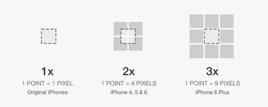
Points vs Pixel comparison
When you are designing for various display types, you should think in points, but design in pixels. This means you will still need to export all your assets in 3 different resolutions, no matter in which resolution you are designing your app.
| Device | Asset Resolution | PPI | Display Size |
| iPhone 6+
6+, 6S+ |
@3x | 401 | 5.5″ |
| iPhone 6
6, 6S |
@2x | 326 | 4.7″ |
| iPhone 5
5, 5S, 5C |
@2x | 326 | 4.0″ |
| iPhone 4
4, 4S |
@2x | 326 | 3.5″ |
| iPhone
1st, 2nd & 3rd Generation |
@1x | 163 | 3.5″ |
| iPad Pro | @2x | 264 | 12.9″ |
| iPad Air / Retina iPad
1st & 2nd Generation/ 3rd & 4th |
@2x | 264 | 9.7″ |
| iPad Mini
2nd & 3rd, 4th Generation |
@2x | 326 | 7.9″ |
| iPad Mini
1st Generation |
@1x | 163 | 7.9″ |
| iPad
1st & 2nd Generation |
@1x | 132 | 9.7″ |
App Icons
|
Device |
App Icon | AppStore Icon | Spotlight |
Settings |
| iPhone 6+
6+, 6S+ |
180×180 px | 1024×1024 px | 120×120 px | 87×87
px |
| iPhone
6S, 6, 5S, 5, 5C, 4S, 4 |
120×120 px | 1024×1024 px | 80×80
px |
58×58
px |
| Old iPhones
1st, 2nd, 3rd Generation |
57×57 px |
1024×1024 px | 29×29
px |
29×29
px |
| iPad Pro | 167×167 px | 1024×1024 px | 120×120 px | 58×58
px |
| Retina iPads
Mini 2 & 3, Air, 3 & 4 |
152×152 px | 1024×1024 px | 80×80
px |
58×58
px |
| Old iPads
1, 2, Mini 1 |
76×76
px |
1024×1024 px | 40×40
px |
29×29
px |
Typography
The default system font on all iOS versions previous iOS 9 is Helvetica Neue. With the release of iOS 9, Apple introduced a brand new font called San Francisco, which replaced Helvetica Neue as the default font. San Francisco comes in two shapes: “SF UI Display” and “SF UI Text”, while “Display” is primarily used for UI components, “Text” features a wider letter spacing and should be used for longer texts. You can download the San Francisco fonts here if you are a member of Apple’s Developer program. In addition to the default font, many alternative font faces are available to use. You can find a complete list of pre-installed typefaces here.
Font Sizes
| Element | Size (pt) | Weight | Spacing (pt) | Type |
| Nav Bar Title | 17 | Medium | 0.5 | Display |
| Nav Bar Button | 17 | Regular | 0.5 | Display |
| Search Bar | 13.5 | Regular | 0 | Text |
| Tab Bar Button | 10 | Regular | 0.1 | Text |
| Table Header | 12.5 | Regular | 0.25 | Text |
| Table Row | 16.5 | Regular | 0 | Text |
| Table Row Subline | 12 | Regular | 0 | Text |
| Table Footer | 12.5 | Regular | 0.2 | Text |
| Action Sheets | 20 | Regular / Medium | 0.5 | Display |
Iconography
In iOS apps, icons have always been a great way to support text labels with a visual relationship to the performed action or to replace text completely (often for very common actions such as “New“, “Delete”, etc.). Usually, we are dealing with icons that are part of the Navigation Bar, Tool Bar or Tab Bar.
Bar Button Icons
Icons used in bars should always have two different states: the default state in outlined style with a stroke width of 1 or 1.5pt and the active state with a solid color fill.

Activity View Icons
Icons in the Activity View (also known as Share Popover) used to be designed in outline style, but since iOS 8, Apple has reverted back to solid fill icons on a plain white background.

Commonly used design elements
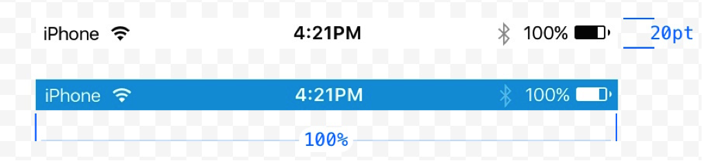
Status Bar
The Status Bar contains basic system information such as the current carrier, time, battery status and more. It’s visually connected to the Navigation Bar and makes use of the same background fill. To match the style of your app and guarantee readability, the content of the status bar comes in two different styles: dark (black) and light (white).
It is possible to hide the Status Bar, but think twice before doing so. For example, users might be interested in knowing if they are connected to a WiFi network when the app regularly downloads web content or if Bluetooth is enabled when the app requires a Bluetooth link to third-party hardware. A valid reason to hide the Status Bar is when you want to remove all distractions from a single element, for example, when displaying full screen content such as an image gallery.
Navigation Bar
The navigation bar contains the controls for navigating through the applications views and optionally to manage the content of the current view. It will always appear at the top of the screen, right below the status bar. By default, the background is slightly translucent and blurs content underneath the bar. The background fill of the bar can be set to a solid color, a gradient or a custom bitmap-pattern.
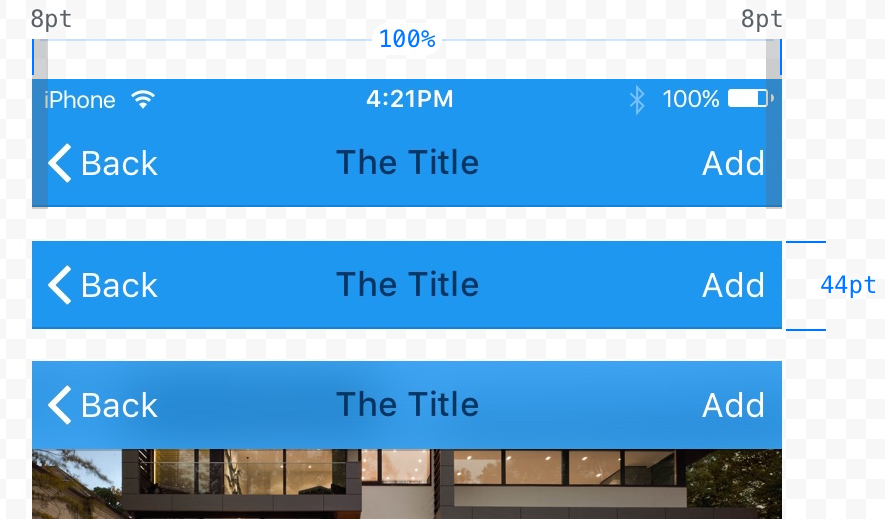
Navigation Bar on iPhone 6 in portrait mode.
The elements should always following a specific alignment pattern.
- Back button should always be aligned to the left side.
- Title of the current view should always be centered in the bar.
- Action buttons should always be aligned to the right side. If possible, there should never be more than one primary action to avoid missed clicks and to maintain simplicity.
Toolbar
A toolbar contains a set of actions for managing or manipulating the content of the current view. On the iPhone, it will always appear aligned at the bottom edge of the screen, while on the iPad, it can also be displayed aligned at the top of the screen.
Similarly to the navigation bar, the background fill of toolbars can be modified, is translucent and blurs the underlaying content by default.
Toolbars should be used when a specific view requires more than three primary actions that would hardly fit or would look messy in the navigation bar.
Search Bar
Search bars come in two different styles by default: prominent and minimal. Both versions do have the same functionality.
- As long as no text was entered by the user, a placeholder text is shown inside the bar, and, optionally, a bookmarks icon that can be used to access recent or saved searches.
- Once a search term is entered, the placeholder disappears, and a clear button to delete the entered value appears on the right edge.
Search bars can make use of a prompt — a short sentence to introduce the functionality in the context of the search. For example, „Enter a city, zip code or airport.“
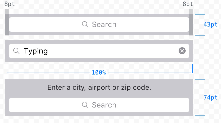 Prominent search bar style, without and with a prompt.
To provide even more control over a search query, it is possible to chain the search Bar with a scope bar. The scope bar will use the same style as the search bar and might be useful when there are clearly defined categories for the search results. For example, in a music app, the search results could be filtered again by interpreters, albums or songs.
Tab Bar
The tab bar is used to allow the user to quickly navigate through the separate views of an application, and it should only be used for this purpose. It always appears at the bottom edge of the screen. By default, its slightly translucent and uses the same system blur for underlaying content as the navigation bar.
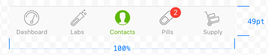
A tab bar can only contain a fixed maximum number of tabs. Once there are more tabs than the maximum count, the last tab displayed will be replaced by a „More-tab“ that will lead to a list of hidden tabs, with an option to re-order the displayed tabs.
While the maximum amount of tabs displayed is five on iPhones, it’s possible to display up to seven tabs on the iPad while avoiding a more-tab.
To notify users about new information on a view, it sometimes makes sense to apply a badge count to a tab bar button. If a view is temporarily disabled, the related tab button should not be completely hidden; instead, it should be faded out to visually communicate the disabled state.
Table View
Table views are used to display small to large amounts of list style information in a single or multiple columns and with the option to divide several rows into separate sections or to group them.
There are two basic table view types that should be used, depending on the type of data you are presenting.
Plain:
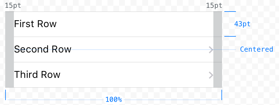
A plain table contains a number of rows that can have a header on the top and a footer after the last row. It’s possible to display a vertical navigation on the right edge of the screen to navigate through the table, which makes sense when presenting a big data set that could be sorted in some way (e.g., alphabetically descending).
Grouped:
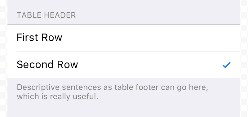
A grouped table allows you to organize rows in groups. Each group can have a header (best used to describe the context for the group) as well as a footer (good for help text, etc.). A grouped table needs to contain at least one group, and each group needs to contain at least one row.
For both table view types, a few styles are available to present the data in a way that allows users to easily scan, read and probably modify it.
Default:
A table row in default style has an optional image aligned on the left and a title.
With Subtitle: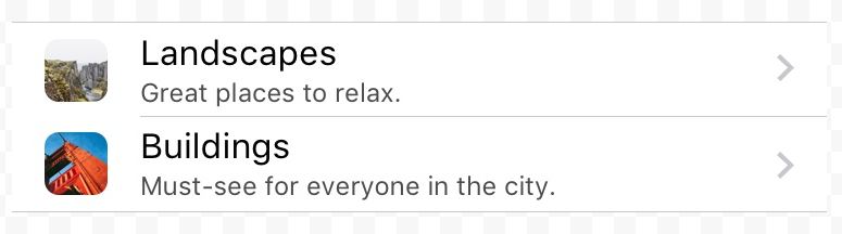
The subtitle table style enables a small subtitle text underneath the row title. It is useful for further explanations or short descriptions.
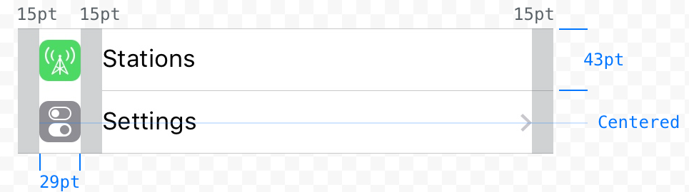
With Value: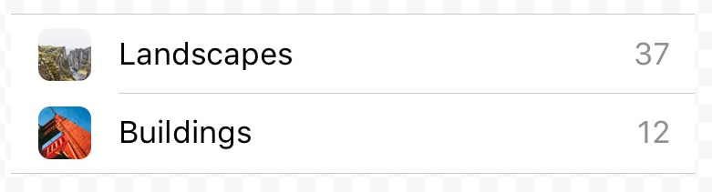
The value table style allows you to display a specific value that is related to the row title. Similar to the default style, each row can have an image and a title that are both aligned to the left. The title is followed by the right aligned label for the value, which is usually displayed in a slightly more subtle text color than the title.
Modals, Popovers and Alerts
iOS provides various styles of temporary views that can be used to display, edit and manipulate data in a way that fits best in a given situation. While each temporary view exists for a very specific purpose and each one looks different, all temporary views still have one thing in common: When displayed, it’s the highest index layer on the current view (they appear on top of everything else), and content underneath is overlayed by a translucent black background.
Activity View:
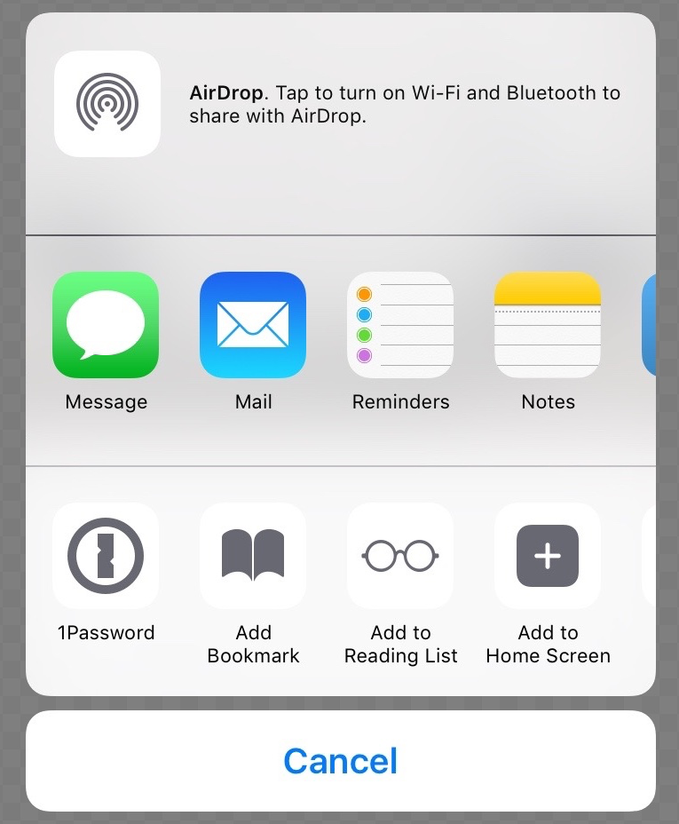
An activity view is used to perform specific tasks. These tasks can be default system tasks such as share content via the available options, or they can be completely custom actions. When designing icons for custom task buttons, you should follow the same guidelines as for the active state of bar button icons — solid fill, no effects, on a transparent background.
Actions:
Action Sheets are used to perform one single action from a list of available actions and to force the user of an app to confirm an action or cancel it.
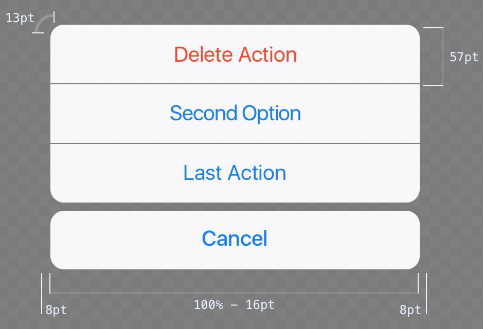
In portrait mode (and on small landscape screen resolutions), actions are always displayed as a list of buttons sliding in and staying at the bottom edge of the screen. In this case, an action sheet should always have a cancel button to close the view and not perform any of the listed actions.
When there is enough space available (e.g., on iPad screens), action sheets visually transform into popovers. A button to close the view is not required anymore because tapping a target anywhere outside the popover will close it automatically.
Alerts:
The purpose of alerts is to inform the user about critical information and optionally to force the user to make a decision about some action.
An alert view does always contain a title text, which should not be longer than one line and one (for pure informational alerts, e.g., “OK”) or two (for alerts that require a decision, e.g., “Send” and “Cancel”) buttons.
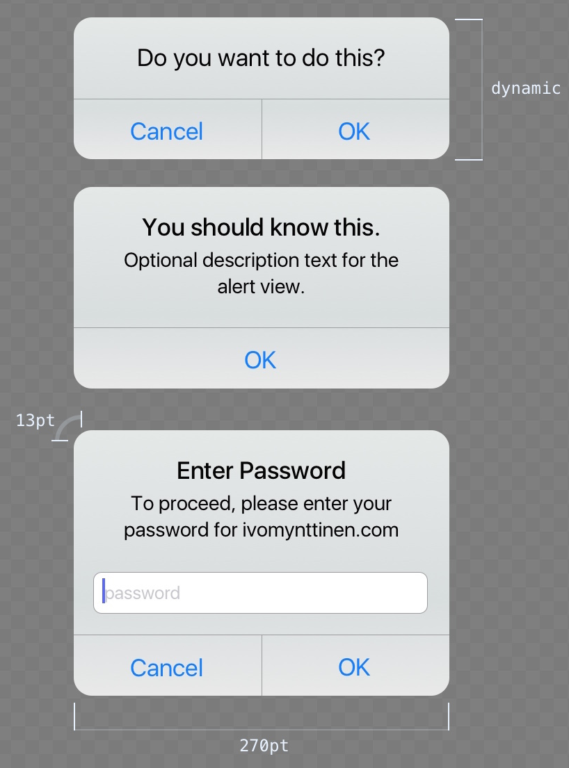
Also, you can add a message text, if needed, as well as up to two text input fields, one of which can be a masked input field, which is appropriate for sensitive information like passwords or PINs.
Edit Menu:
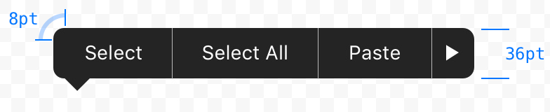
The Edit Menu allows users to perform actions such as Copy, Paste, Cut, etc., when an element is selected (text, images, others). While it is possible to control which operations the user can choose from, the visual appearance of edit menus is set and not configurable unless you build your own completely custom edit menu.
Popover:
Popovers are useful when a specific action requires multiple user inputs before proceeding. A good example is adding an item, which has a few attributes that need to be set before the item can be created.
In a horizontal environment, popovers reveal underneath the related control (such as a button) with an arrow pointing to that control while opened. The background of a popover uses a slightly reduced opacity and blurs the content underneath, just as many other UI elements have done since iOS 7.
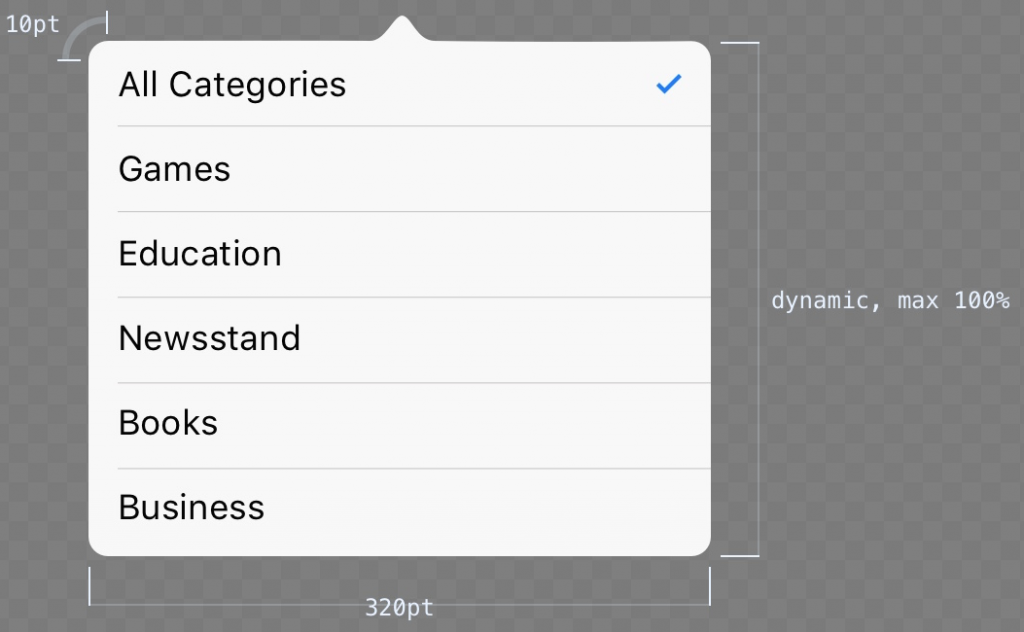
A popover is a powerful temporary view that can contain various objects such as its own navigation bar, table views, maps or web views. When a popover grows in size due to the number of contained elements and reaches the bottom edge of the viewport, it is possible to scroll within the popover.
Modals:
Modals are a useful view for tasks that require multiple commands or inputs by the user. They appear on top of everything else, and, while open, block interaction with any other interactive elements underneath.
The typical modal usually provides:
- a title to describe the task;
- a button to close the modal without saving or performing any other actions;
- a button to save or submit any entered information; and various elements for user input in the modal body.
There are three different modal styles available:
- Full screen: covers the entire screen.
- Page sheet: In portrait mode, the modal covers the underlying content only partially, leaving a small portion of the parent view visible underneath the translucent black background. In landscape mode, the page sheet modal acts just like a full screen modal.
- Form sheet: In portrait mode, the modal appears in the center of the screen, keeping the surrounding content of the parent view visible underneath the translucent black background. The position of the modal adjusts automatically when a keyboard needs to be displayed. In landscape mode, the page sheet modal acts just like a full screen modal.
Controls
iOS provides a wide range of controls for basically any required input type you can think of. Listed below you will find the most important (commonly used), but for a full list of the available controls, you should look at the iOS Developer Library.
Buttons:
Probably the most used control overall is the good old button. Since iOS 7, the default button design hasn’t really looked like a button anymore, but rather more like a plain text link. The button control is highly customizable and allows you to style everything from text style, drop shadows and color to an icon that is either prepended or centered if there is no text label, as well as fully custom backgrounds.
Keep in mind that a button can have several states, which should be communicated with visual language: default, highlighted, selected and disabled.
Pickers:
Pickers are used to select one value from a list of available values. The web equivalent would be a select box (which the picker control is also used for when touching a select in Safari). An extended version of picker is the datepicker, which allows the user to scroll through a list of dates and times and select values for (configurable) day, month and time.
Left: datepicker displayed inside a table view, right: picker as keyboard.
Except for the background color, it is not possible to change the visual style or size (same as keyboard) of a picker control. Most often, they appear at the bottom of the screens, where keyboards appear as well, but it is possible to use them in other positions.
Segment Controls:
A segment control contains a set of segments (at least two) that can be used for things like filtering content or to create tabs for clearly categorized content types.
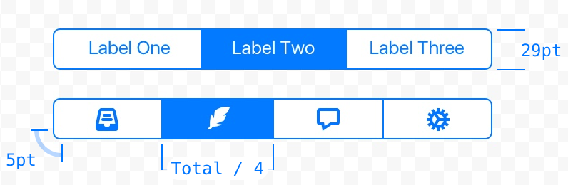
Segment control without and with icons.
Each segment can contain a text label or an image (icon), but never both. In addition, using a mixed set of segment types (text and images) in one segment control is not really recommended. The width of one segment changes automatically based on the number of segments (two segments: 50% of total control width, 5 segments: 20% of total control width).
Sliders:
The slider control allows the user to choose one specific value from a range of allowed values. Since choosing a value works pretty smoothly and without any steps, sliders are recommended for selecting an estimated, but not exact, value. For example, a slider would be a good control for setting the sound volume, since the user can hear the difference and can see the difference between loud and very loud, but a text input to set an exact dB value would be impractical.
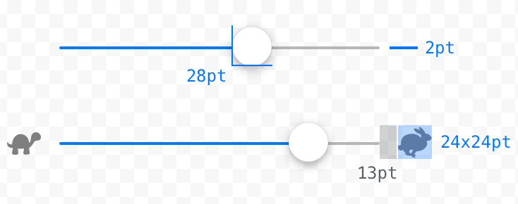
Slider control without and with descriptive icons.
It is possible to set icons for the minimum and the maximum value, which are displayed on the start and end edge of the slider control, thereby allowing you to visually embrace the purpose of the slider.
Stepper:
Steppers should be used when the user should enter an exact value from a limited range of possible values (e.g., 1-10). A stepper always contains two segmented buttons, one for lowering and one for raising the current value.
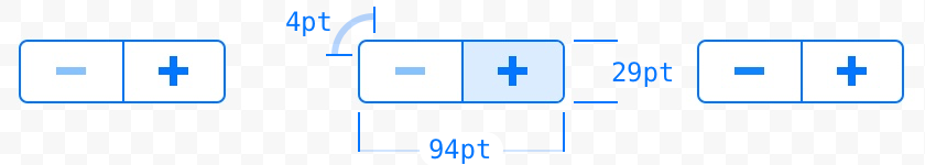
Visually, the stepper control is highly customizable:
- You can use your own icons for stepper buttons;
- When maintaining the native iOS look, you can customize the color of borders, background and icons by using a tint color, which automatically sets the color for each of these elements; and
- If you want to go further, you can use completely custom background images for the stepper buttons as well as for the separator.
Switch:
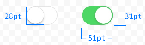 A switch allows the user to quickly toggle between two possible states: on and off. It’s the checkbox for iOS apps. It is possible to customize the color for the on and off states, but the appearance of the toggle button and size of the switch are set and cannot be changed.
Keyboard:
There are various keyboard types available to provide the best possible keyboard for a specific text input. While it is possible to build your own completely custom keyboard, default keyboards cannot be customized in style or size.
Credit and attribution:
“The iOS Design Guidelines” by Ivo Mynttinen–